
Metro Data on Rental Cost Burdens Show Uneven Improvement
The national trend in cost burdens is reflected across most metropolitan areas of the US. Looking at the 100 largest Metropolitan Statistical Areas (MSAs) by population that have not undergone geographic boundary changes between 2005 and 2015, shows that in most metros, cost burden rates declined modestly for renters in 2015, but were still high relative to their levels in 2005. (A household is defined as cost-burdened when it spends more than 30 percent of its income on housing.)
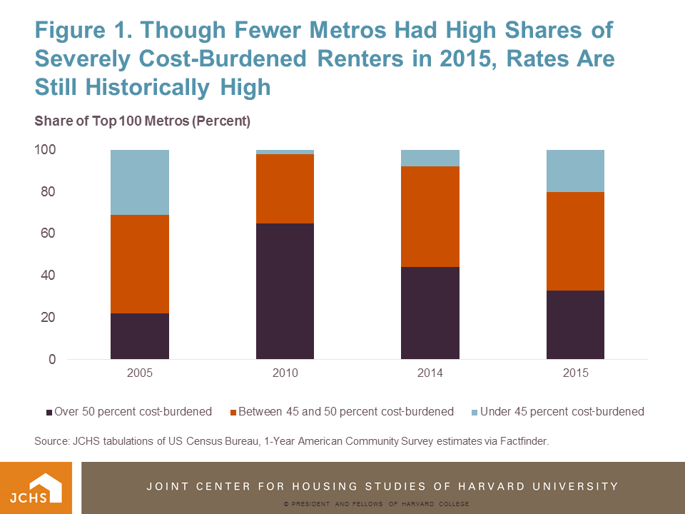
Looking at cost burden rates among the top metros as a group, we find the number of metro areas with exceedingly high cost burden rates declined in 2015. Indeed, the number of metros where cost burdens affect at least half of all renters declined from 44 metros in 2014 to 33 in 2015, which is a significant improvement from 2010 levels, when cost burdens affected half of all renters in 65 metros. In total, between 2010 and 2015, fully 83 metros saw declines in the share of cost burdened renters.
Even with these improvements, however, the share of cost-burdened renters is still above 2005 levels in most metros. More than half of rental households were cost-burdened in 33 metros in 2015, an increase of 11 metros from 2005 (Figure 1). Moreover, renter cost burden rates in 66 metros were higher in 2015 than they were in 2005.
Source: JCHS tabulations of US Census Bureau, 1-Year American Community Survey estimates via Factfinder.
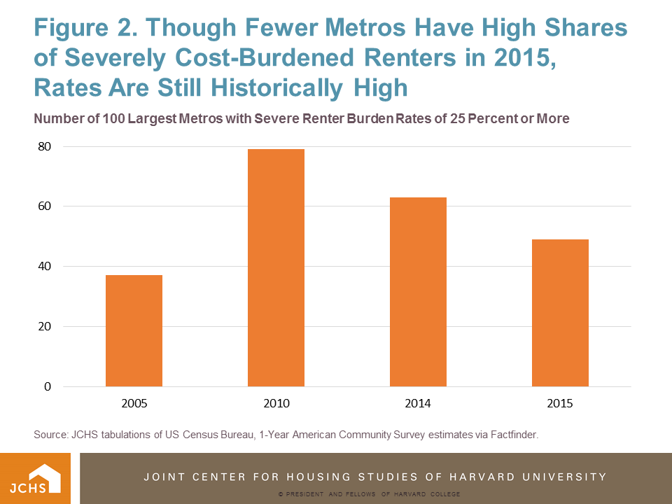
This trend is also evident for the more extreme measure of severe cost burdens (those paying more than 50 percent of income for housing). From 2014 to 2015, the number of metros with severe renter cost burden rates of 25 percent or more declined from 63 to 49 of the top 100 metros, respectively (Figure 2). This is a big improvement from 2010, when 79 metros had such high rates of severely cost-burdened renters, but still worse than in 2005, when it was just 37 metros.
Source: JCHS tabulations of US Census Bureau, 1-Year American Community Survey estimates via Factfinder.
Indeed, despite significant near-term improvement, severe cost burdens have yet to return to 2005 levels in most metros. In the 100 largest metros for which data extends back to 2005, 60 had larger shares of severely cost-burdened renters 2015 than in 2005.
Lastly, initial analysis finds that the 2015 data also show the profile of metros with the highest burden rates appears to have shifted somewhat. In 2015, metros with the highest shares of severely cost-burdened renters are generally the large metros with tight housing markets along both coasts, including New York, Miami, and Honolulu. In 2005, the profile of metros with this high share of severe cost burdens was different; though some coastal metros were included (like Miami and Stockton, CA), midwest and declining industrial metros were more prevalent among the severely cost-burdened metros (including Cleveland, Detroit, Rochester, and Memphis).
We’ll post additional analysis on this dataset in the coming weeks and months.
See the full metro Excel table for a complete set of metro-level cost burden data for 2015.