10 Surprising Facts from America’s Rental Housing 2020
A few weeks after our research team has started digging into the data for a new report, we get together and share preliminary findings and figures. Even for people who work with housing data every day, there are always facts that stand out as truly remarkable. Some are historic highs or historic lows, some are the worsening of a problem we didn’t think could get much worse, and some are the product of a new analysis we’d never tried before. These were 10 facts that jumped out at me from our recently released America’s Rental Housing 2020:
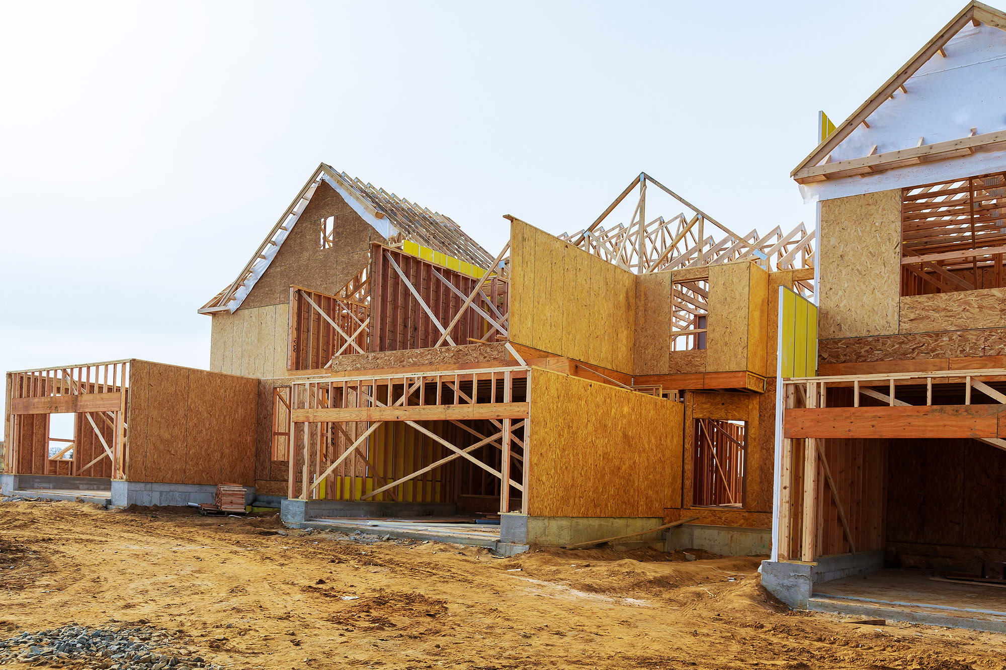
1. Apartment construction is near a 30-year high
Multifamily construction peaked in 2015 with 397,000 starts, the highest level in three decades. Through the first three quarters of 2019, starts were running at an annual rate of 380,000 units. A growing share of these multifamily starts (93 percent) are intended as rentals, compared to the 78 percent average since 1974. Additionally, the multifamily pipeline is the fullest it’s been since the early 1970s with more than 600,000 units currently under construction.
Report Figure 22:
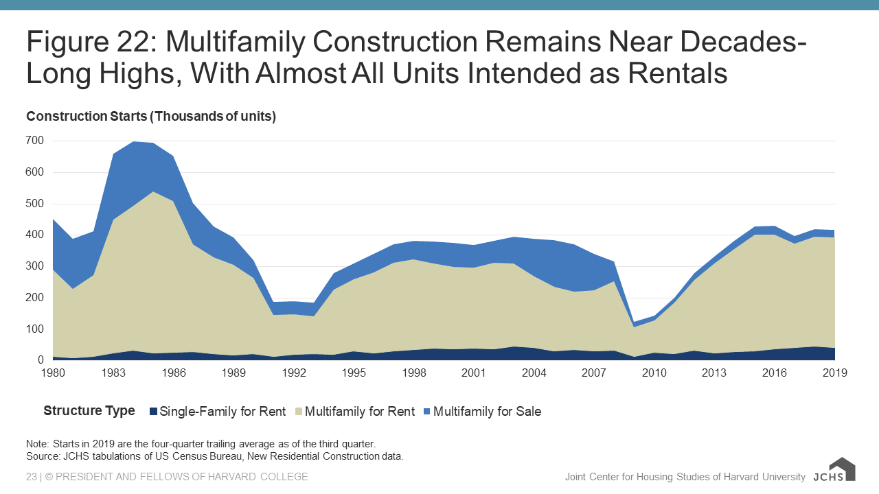
Note: Starts in 2019 are the four-quarter trailing average as of the third quarter.
Source: JCHS tabulations of US Census Bureau, New Residential Construction data.
2. Most of that new construction has been in big, centrally located buildings
Of the new apartments completed in 2018, 61 percent were in buildings with 50 or more units. In the 2000s, the annual average share of new apartments in large buildings was just 27 percent. Most of these apartments are going into the core counties of major metro areas. The rebound in multifamily construction in cities has been substantial, growing from a recession low of just 51,000 permitted units to 256,000 in 2018.
3. Vacancy rates are at a 30-year low
Despite the volume of new construction, many markets remain tight. In mid-2019, the rental vacancy rate hit 6.8 percent, the lowest we’ve seen since the 1980s. Vacancy rates for professionally-managed apartments stood at less than 5 percent in 135 out of 150 major markets, including 45 markets with vacancy rates below three percent. The vacancy rate among lower-quality apartments also dipped below 5 percent in 2019.
4. Rents have gone up for 29 consecutive quarters
Twenty-nine quarters of real rent growth is just one quarter short of the longest streak in records that go back to the 1940s. Over this seven-year period, rents rose by 27 percent. That’s four times faster than the rise in prices for all other goods. The third quarter of 2019 also marked 21 consecutive quarters of nominal rent increases above 3 percent.
Report Figure 21:
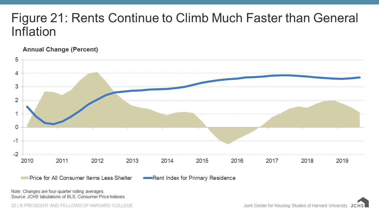
Note: Changes are four-quarter rolling averages.
Source: JCHS tabulations of BLS, Consumer Price Indexes.
5. The low-rent stock declined by an additional 410,000 units from 2017–2018 alone
The number of units renting for under $600 (in inflation-adjusted dollars) dropped by more than 3 million from 2012 to 2017, either due to rent increases, tenure conversions, or demolitions. The trend continued into 2018, further limiting the supply of units affordable to lower-income renters. With construction at the high end and declines at the low end, the rent distribution continues to shift ever higher.
6. High-income households have driven more than three-quarters of renter growth since 2010
The number of households making more than $75,000 a year rose by 3.2 million from 2010 to 2018. Over this period, these high-income households accounted for 76 percent of the growth in renter households. This is a dramatic shift from the 2000s when households making less than $30,000 drove 93 percent of renter household growth. High-income households now make up nearly a quarter of all renter households.
Interactive: Across the Country, Most of the Growth in Renters Is High-Income Households
7. Cost burdens rose, driven entirely by renters making more than $30,000
After three years of modest improvements, the number of cost-burdened renter households increased by 261,000, reaching 20.8 million in 2018. The share of cost-burdened renters also rose 1 percentage point to 47.5 percent. All of the net growth in cost burdens came from middle- and high-income renters. The number of cost-burdened renters earning between $30,000 and $75,000 rose by 320,700 in 2017–2018 while the number for those making more than $75,000 rose by 51,300.
Interactive: Cost Burdens Rise for Middle-Income Households in Most Metros
8. Middle-income cost burden rates are increasing in metros of all sizes
Increasing cost burden shares among middle-income renters are not limited to the largest or most expensive metros. Large metros with populations over 5 million did have the fastest growth in middle-income cost burdens, with the share for households making between $30,000 and $45,000 rising by nearly 8 percentage points in 2011–2018 to 67.4 percent. However, middle-income burdens also rose by more than 4 percentage points in medium metros (populations between 150,000 and 5 million) and by 3 percentage points in small metros (populations between 10,000 and 150,000). Even households making $45,000 to $75,000 had increasing burdens in metros of all sizes and in rural areas.
Report Figure 28:
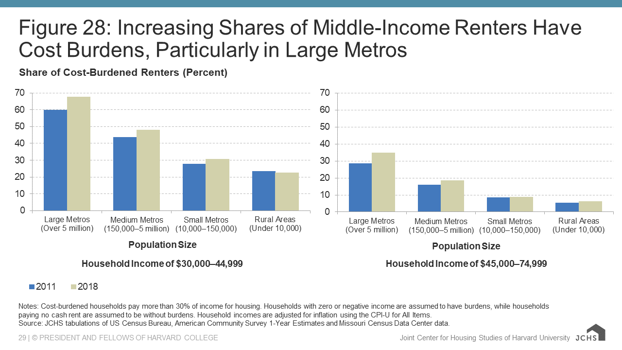
Notes: Cost-burdened households pay more than 30% of income for housing. Households with zero or negative income are assumed to have burdens, while households paying no cash rent are assumed to be without burdens. Household incomes are adjusted for inflation using the CPI-U for All Items.
Source: JCHS tabulations of US Census Bureau, American Community Survey 1-Year Estimates and Missouri Census Data Center data.
9. Rental housing is sparse in nearly a third of all neighborhoods
Just under one-third of all census tracts in the country are “rental deserts” where less than 20 percent of the housing stock is either renter-occupied or available for rent. Moreover, 10 percent of all census tracts had rental shares below 10 percent. Most rental deserts are located in the low-density portions of metro areas (53 percent) and in rural areas (43 percent). Because low-income and minority households are more likely to rent, rental deserts contribute to income and racial/ethnic segregation. Neighborhoods we defined as rental deserts had median household incomes of $71,400 and were 78 percent white. For all other neighborhoods, the median income was much lower at $49,100 and the population was 54 percent white.
10. 10.5 million renter households live in areas prone to natural disasters
The number of billion-dollar disasters is increasing, and renters and rental properties are vulnerable when disasters strike. More than 10 million renter households live in zip codes that suffered at least $1 million in disaster-related home and businesses losses in 2008-2018. And more than half a million rental units required repair due to extensive disaster-related damage from 2015–2017 according to the American Housing Survey. Federal aid has disproportionately favored homeowners, with renters receiving only small shares of recovery funds or temporary housing assistance in the wake of disasters.
Report Figure 38:
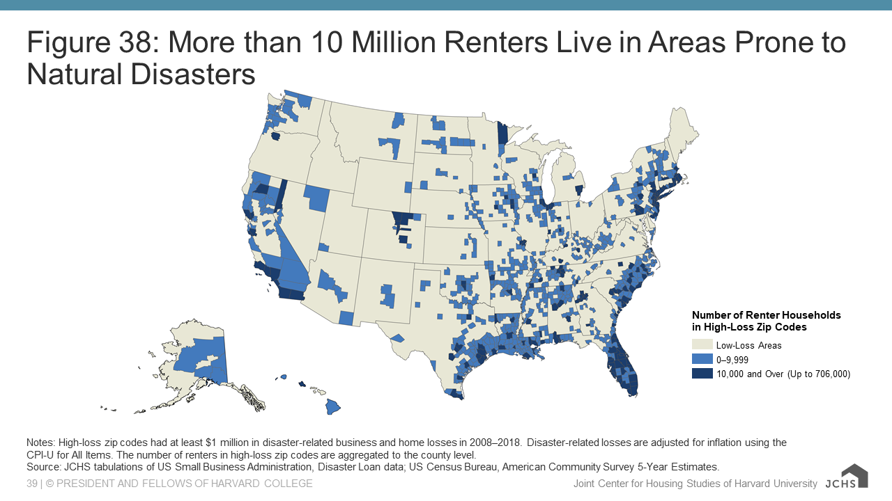
Notes: High-loss zip codes had at least $1 million in disaster-related business and home losses in 2008–2018. Disaster-related losses are adjusted for inflation using the CPI-U for All Items. The number of renters in high-loss zip codes are aggregated to the county level.
Source: JCHS tabulations of US Small Business Administration, Disaster Loan data; US Census Bureau, American Community Survey 5-Year Estimates.
For even more surprising (and some less-surprising) facts, check out America’s Rental Housing 2020.