New Interactive Tool Shows Two Decades of Social & Economic Change in Greater Boston
A new interactive mapping tool showing the dramatic demographic, social, and economic changes that have occurred in Greater Boston since 1990 is being released this week by the Joint Center for Housing Studies and was the focus of a webinar on Friday, February 1.
Developed with partial financial support from The Boston Foundation, the Boston Neighborhood Change Mapping Tool allows users to visualize Census Bureau data on home prices, rents, household incomes, race and ethnicity, education levels, and housing cost burdens in each of the 1,003 census tracts that make up the Greater Boston area. The tool includes data from the 1990 and 2000 decennial censuses and from the American Community Survey (ACS) 5-Year Estimates for 2010 and 2016.
The tool features six Recommended Maps that illustrate growing racial and economic diversity, increased income inequality, the spread of concentrated poverty, growing housing affordability challenges, and gentrification in previously low-income neighborhoods. Moreover, users can see how these maps change when any of the metrics used to create them are altered. (Figure 1)
Figure 1. Cost Burdened Renters in Greater Boston, 2016
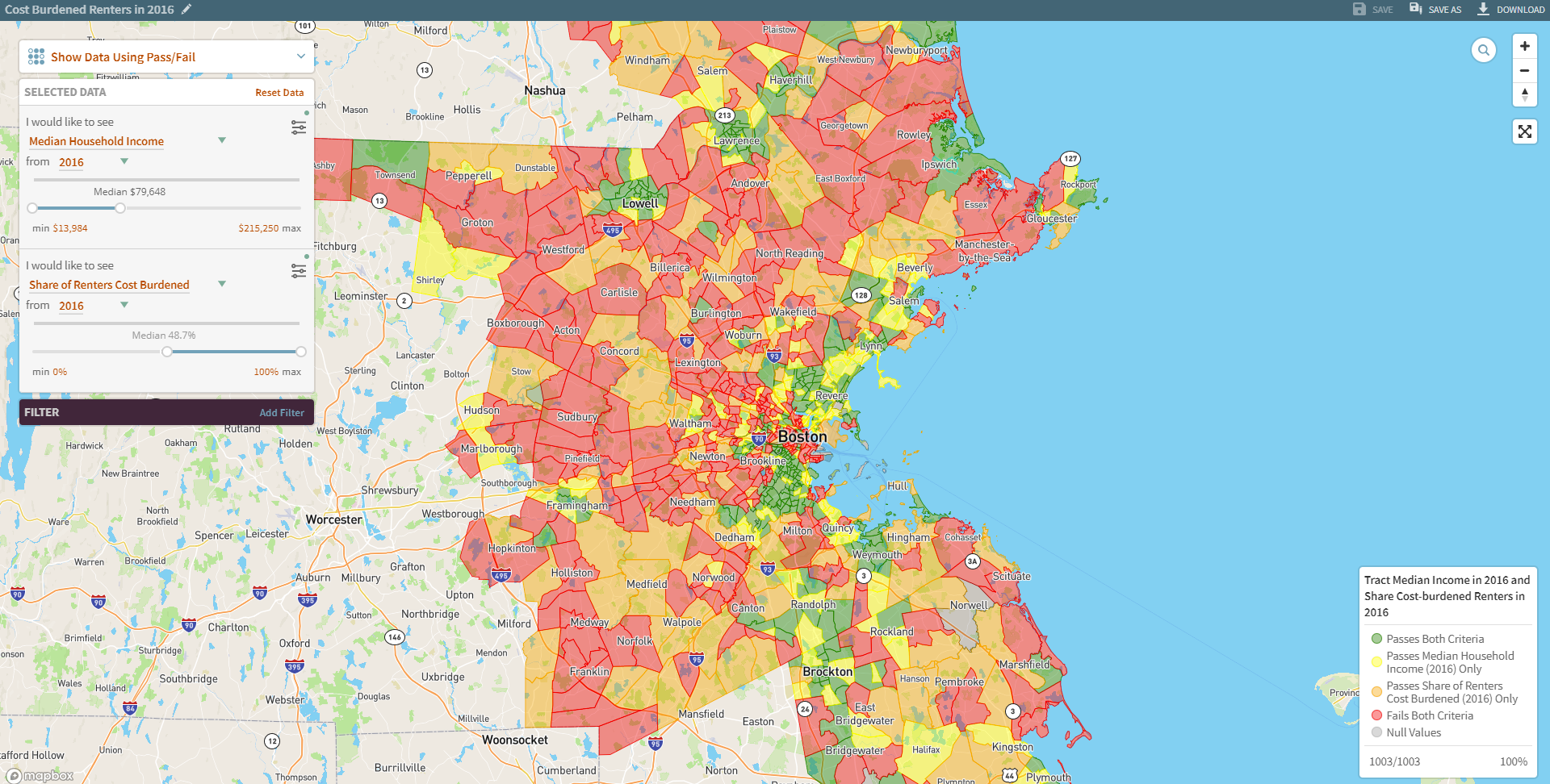
Note: This map shows tracts where median incomes were less than in the region as a whole and/or where the share of cost-burdened renters was greater than 48.7 percent, the share for the region as a whole.
Sources: Joint Center for Housing Studies, Boston Neighborhood Change Mapping Tool and 2016 American Community Survey
The tool has several other noteworthy features, allowing users to:
- Define cut-off points: The map’s “show data in groups” tool allows users to see how tracts differ on a single metric, such as median household incomes in 2016. They can also choose multiple categories and where the cutoffs should be between them.
- Show places that meet two criteria: The map’s “pass/fail” feature allows users to see which tracts meet two criteria, such as: (1) places where median incomes were less than the region’s median in 1990 and (2) places where median incomes rose more than those in the region did between 1990 and 2016. The tool can also show places that meet the first, but not the second criteria, and vice versa.
- Limit analyses to certain types of places: The map’s “filter” tool allows users to narrow their analyses to tracts that meet up to three criteria and then, using the tools described above, see how those tracts differ in other ways. For example, the filter tool can be used to identify tracts where median household incomes were less than in the region in 1990. Then, the “show data in groups” tool can compare median rents in those places in 2016. Alternatively, the pass/fail tool can display tracts where median rents and/or the share of people with bachelor’s degrees increased faster than in the region as whole between 1990 and 2016. (Figure 2)
- See tract level data: In any of these configurations (and in the recommended maps), users can click on a tract to get more information, including the exact data used to create the current map.
- Save, download, and print maps and data: Users can save their maps, download them as PDFs, or download them as JSON files for future use. Users can also download the underlying Excel data, which was drawn from the Center’s Neighborhood Change Database.
Figure 2. Gentrification in Greater Boston, 1990-2016
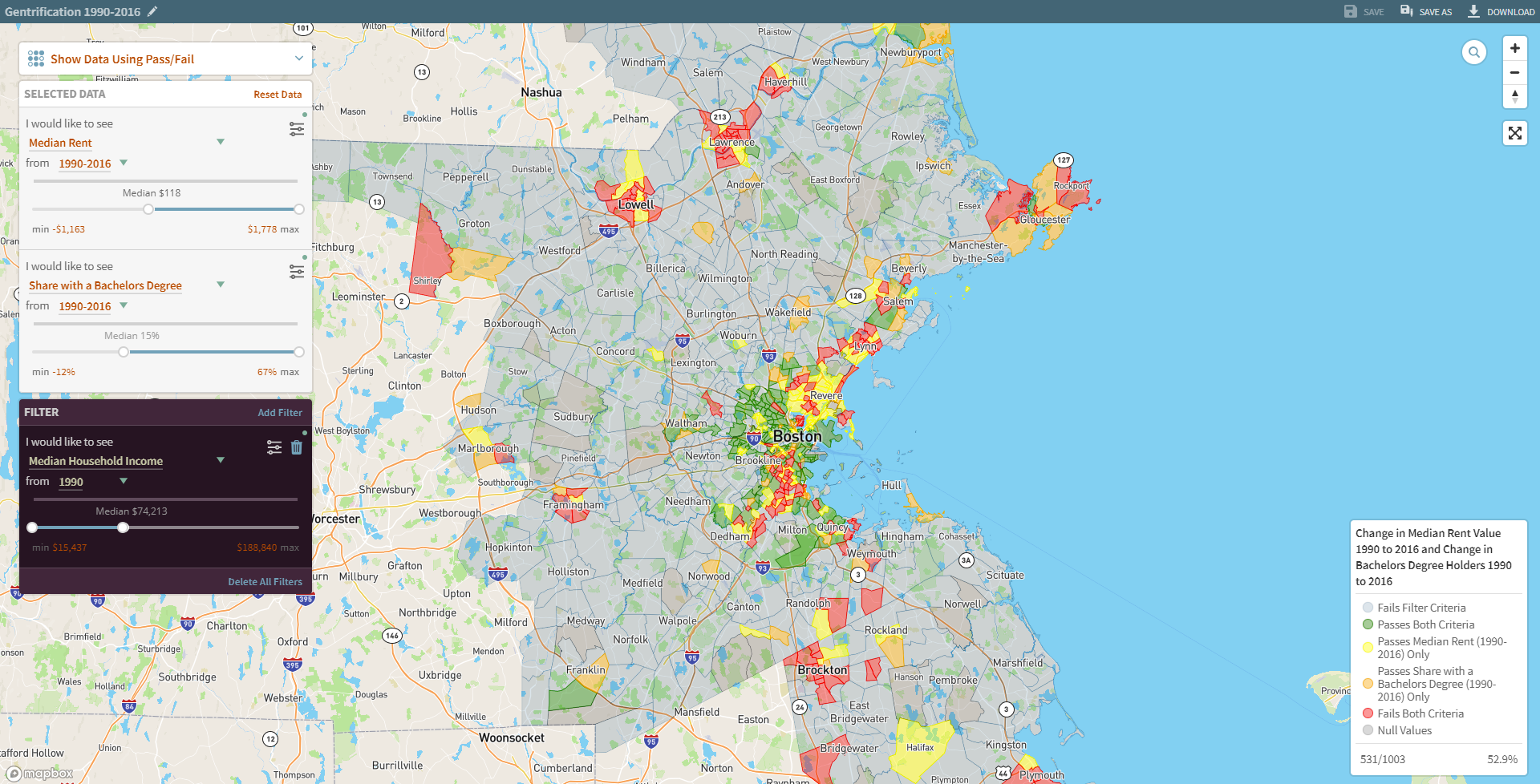
Notes: This map shows that many, but not all, low-income tracts in 1990 (where median incomes were below the metro-wide median in 1990) saw median rents and shares of adults with a bachelor’s degree grow faster than the region’s average between 1990 and 2016.
Sources: Joint Center for Housing Studies, Boston Neighborhood Change Mapping Tool 1990 Census and 2016 American Community Survey
In conjunction with the new tool, we also released a new research brief, Mapping Over Two Decades of Neighborhood Change in the Boston Metropolitan Area. The brief uses the tool to highlight six dramatic changes that have occurred in Greater Boston between 1990 and 2016:
- Growing Racial and Ethnic Diversity but Continued Isolation within the Region
- Increased Affluence but Rising Levels of Income Inequality
- Somewhat More Concentrated Poverty
- Declining Amounts of Modest-Cost Housing
- Rising Numbers of Cost-Burdened Renters and Homeowners
- Both Gentrification and Stagnation in Low-Income Tracts
If you have any questions about the mapping tool, contact [email protected].